
Episode 7: Partisanship in politics & Network Science
- Asaf Shapira

- Apr 11, 2021
- 22 min read
Updated: Nov 21, 2021
What's the rumpus 😊 I'm Asaf Shapira and this is NETfrix, the Network Science Podcast. In the last few weeks, months and even years, there's a buzz about the issue of polarization in politics.
Partisanship seems to manifest itself everywhere from the House of delegates to social media, Maybe, that's why we prefer to stay in our echo chamber castles because out there, we know it's a killing zone for different opinions. For some, a bit more old-fashioned, I guess, this ain't a problem because they are satisfied with just leaving the ol' FU talkback on an article they haven't bothered to read.
Network science doesn’t shy from a bar fight and it too can throw a chair or break a bottle on someone's head when called for. But in the skirmish, network science stands out from the rest because of one huge difference. Network science brings to the fight its gentle giant companion - data. The reason polarization is such a trigger word for networks is because polarization means that the ties, links or edges that held us together are falling apart, making us disjointed components in the network. And in a network sense – that's an anomaly. Networks, as we have learned, densify over time, making our world smaller and smaller. So is it true that the tide has shifted and we're pulling ourselves further and further apart from each other? and If it's true, can we please round up the usual suspects, meaning social media like Facebook or Twitter, blame t h e m for tearing us away from each other, and then burn those digital screens in the market square? Can you imagine it? We would brace one another, warming ourselves by the fire, promising each other we would never let a post or a tweet pull us apart.
Well… don’t throw your IOS to the bonfire just yet. I need the downloads. So, let me distract you with some academic papers about network science and partisanship that you can burn afterwards, you pyromaniacs. But first, a word of caution-
Though I'll do my best to explain each "scienci" term here, I strongly recommend to go over episode 5 on NETfrix about communities in networks. As I said earlier, I need the downloads.
Perhaps the most famous example of political polarization in network science is Lada Adamic's paper: "Divided they blog", that showed partisanship in the political blogosphere. Adamic, is a famous data scientist and even has an algorithm for link prediction named after her. She's currently the Director of Core Data Science in Facebook and a funny anecdote, a friend of mine from Facebook set up an appointment with her and asked her if he needed a PHD to be accepted into her department. By the looks on her face he realized that the only one there without a PHD is probably her secretary that scheduled the appointment.
Back to Adamic's paper, it mapped the U.S. political blogosphere during George W. Bush's 2004 election vs. John Kerry. Each blog was labeled by its affiliation to the Republican or Democratic party. Then, by mapping which blog cited which blog, a network of blogs was constructed.
Although the paper's dataset contained a network of 1500 blogs, the paper didn’t analyze the entire network but only referred to smaller, filtered networks. The authors used thresholds to filter out weak edges and showed how the filtered network that emerged consisted of two disjointed components – the Democratic blogs on one side, and the Republicans on the other. The paper concluded that the political discourse was polarized, meaning the two communities didn’t engage in a dialogue, but only resonated their own opinions, indicating partisanship. It should be noted that it was among the first papers, perhaps the first, that made use of the term "echo-chamber", that is, the effect of resonating opinions similar to our own while filtering out opinions we don’t care for. Locking ourselves in this kind of metaphoric chamber, entrenches us in our previous positions and in our feeling of righteousness. But what probably made this paper iconic is the featured picture of the large blogosphere network containing the 1500 blogs, which as mentioned before, was actually left unanalyzed. The optics of it showed two large communities, blue / Democratic and red / Republican with only a few links between them.

Just as a reminder, about the same year Adamic published her paper, Mark Newman published his paper about community detection in networks that opened a new and exciting field in network science. So, it would be anachronistic to expect the paper to have applied community detection algorithms on the network. What Adamic did instead was to use strong visual aids: As mentioned, the nodes in the network were colored by affiliation – red for Republican blogs and blue for Democrats, and the edges between them were colored yellow. The graph layout she used, which I guess was a force-directed layout, made the network look as though it was made of 2 dense clusters, with only a few edges between them. In recent years, there were some who've raised doubts about this famous image. Does its visualization really tell the story behind the data?
So, since a person can achieve greatness by creating an icon or criticizing one, I chose the easier path to fame and checked the data myself. When I applied community detection (Louvain of course, funny you should ask), It seemed I got pretty much the same results that Adamic got meaning 2 distinct clusters – a Republican and a Democrat. In both cases, there were a few Democrat blogs in the Republican cluster and vice versa, but the vast majority of each cluster could be clearly labeled. And in both cases, there were a few edges between the two clusters or communities. Well… It seemed that my quest for fame reached a dead end. But - when I say a few edges between clusters, the question arises: what is "a few"? Clusters with no edges between them is a clear-cut case of polarization. But "a few edges" is a relative term. The thing is the paper presented only a snapshot of the network, meaning it didn’t follow the network over time. So, it seems that even if we get the number of edges connecting the 2 clusters, we can't compare the number to anything, rendering it useless for comparison purposes. Or does it?
To answer this, we'll need to dig deeper into some issues we've talked about in episode 5 about community detection, and I'll give you a hint – there's a reason why I'm such a sucker for the Louvain algorithm that I've applied here, but – we'll put a pin in it for the time being and play along with Adamic's original narrative that the two parties were not willing to interact with each other. But is it realistic to ask opposing factions to strive for mutual listening?
Dr. Oren Tzur from BGU, studied interactions between opposing factions in a project he titled "The Parliament Project". The project examined the political discourse on Twitter in Israel and its inspiration came from the Washington Post's project titled "Blue feed, Red feed". The aim of the "Blue feed/Red feed" project was to show how our political affiliation affects our feed. For this end, the Washington Post had created two fictitious Facebook users, each of them expressing interest only in publications of one of the camps, either the Democrat's or Republican's. When the two feeds of the users were shown side by side, it was very interesting to see how different were the views each user was exposed to on the same issues. Dr. Tzur didn’t use fictitious users in his study but rather labeled real users as left, right or center based on their own proclamation. Surprisingly, he found that there was more back and forth going on between right wing and left wing users than between the leftists themselves. The simple explanation for this was that in the collected dataset, there were about 4 times more users identifying themselves as right wing than left wing. Not so surprisingly, he found that the tweets between the parties were less like the sophisticated political discussion in an 18th - century Parisian salon and more resembling the shouts of the coachmen who waited outside. Dr. Tzur described it, in the words of a famous Israeli comedian: "A monologue is when one person speaks to himself and a dialogue is when two people speak to themselves". Another discouraging answer can be found in a network study made by Gilad Lotan, an Israeli data scientist, who studied the Twitter network during Israel's big military campaign in Gaza in 2014.
While studying the network, he found, of course, a pro-Israel tweeting community and a rival pro-Palestinian community. He also found a community of the leading world media companies that was much more connected to the pro-Palestinian community than to the Israeli one. This somewhat reinforces the subjective feeling that some Israelis feel that Israel's narrative doesn’t get enough attention.

But another interesting finding that stood out was the role of the Haaretz newspaper in the network. Haaretz, which is a longstanding newspaper in Israel, about a 100 years-old, comes out as a central node in the network with very high betweenness score. Betweenness, is a centrality measure we talked about in episode 4 that measures the role of a node as a bridge between parts of the network. Haaretz newspaper scored high on Betweenness because of its location between the Israeli and Palestinian communities. In fact, without it, the two communities would almost have become two disjointed components, that is, detached from each other. This newspaper was almost the sole node in the networks that enabled the transfer of information between the rivaling parties. Haaretz is a hardcore left-wing newspaper, which makes it seem as though the willingness to hear the other side is a political opinion of its own, which on the personal level, seems a shame to me, because we should strive for mutual listening, no matter where we stand on the political scale.
Since Adamic's blogosphere study was so iconic, it's no wonder other similar papers were soon to follow. But since the blogosphere has known better days, the object o research turned to social media. For example, a paper in 2017 titled "Divided we tweet" as a tribute to Adamic, looked for the Twitter accounts of those bloggers that Adamic followed and tried to apply to them network analysis. The paper is a great example of how not to do data analysis in general and network analysis in particular. What the authors did there was to take 2000 American journalists on Twitter and label them on a political scale, which, not surprisingly, was normally distributed. As we know from our previous episode about the Power Law, political opinions are a bell-shaped distribution with a few on the left, a few on the right, but most people rally toward the center. And this is where the biases and the data mangling began: Because they noticed that journalists covering foreign news tended to the left and this didn't fit their objective, they simply filtered them out. But this was just the beginning.
They used the K-means algorithm for community detection, an algorithm which we've talked about a bit in the episode about communities. Full Disclosure: I don’t care for K-means when it comes to network analysis. The reason is that it requires some parameters in advance, and I believe that this scenario-driven approach somewhat undermines the data-driven joy of discovering the unknown. In the case of K-means, it requires predetermination on the number of communities we expect to find in the network. Somewhat naively, the authors of the paper asked K-means to divide the journalists' Twitter network into 2 communities. What they expected to find is a Republican community and a Democratic community. What they discovered was that the algorithm really did divide the network into two communities, but they found that one community was of the extreme right users and in the other community – all the rest. The extreme right community tended to retweet mainly itself and so became a clique-like community, or a community which has everyone in it connected but with only a few edges heading outside. Instead of stopping here and say: "Hey, the data revealed to us something new we hadn’t thought of. There is polarization, but it's actually between the far right and all the rest", well… the authors decided to go medieval. To find the polarization they were looking for, they began torturing the data, and as we all know, when data is tortured - it will confess to anything.
So, they removed the journalists they labeled as having center views to produce fictitious polarization. But even after doing that, there were still some links binding the lefts and the rights.
I'm not suggesting that there isn’t some degree of polarization. I'm just saying that we tend to see things in the narrow perspective of the here and now and miss out the big picture that gives us room for comparison over time. An example for this kind of attempt to compare polarization over time can be found in the following paper titled: "The Rise of Partisanship and Super Cooperators in the US House of Representatives".
The paper produced a network from similar votes in the House of Representatives, meaning there's an edge between delegates if they've voted the same on an issue. The dataset contained about a hundred years of voting in the various tenures of the U.S. House of Representatives. The paper found a total of 3.4 million pairs of similar votes going across the two leading parties compared to only 2.2 million pairs from the same party. To me, this by itself sounds like a novel finding. But then, the authors started to filter the data and enforced a threshold on the edges in order to get only the edges that carry a big weight. The results they got presented some scary graphs, showing extreme polarization lately, as Republicans only vote with Republicans and vice versa. But from a historical perspective, when taking an in depth look at the filtered graphs presented in the paper, one can see that the peak of polarization was actually in 2007, the Bush era. And after Obama was elected, the polarization moderated a bit, showing that the polarization trend, if there was one, is not consistent. Another ray of sunshine in their findings was that there was some cooperation going on. They found that some delegates were more likely to cooperate than others. Those delegates were usually the Democrats from southern states (Texas, Alabama etc.) and the Republicans from "blue" states like New York. This finding aligns with what we've talked about in the episode about community detection: we've talked about the homophilic trait of communities, meaning that communities congregate around common interests. We've also mentioned that the most popular homophilic trait we'll find in networks is that of geographical proximity. And this is exactly what the authors of the paper found:
Though the delegates of the same party share similar political views, the geographical homophilic trait kicks in and balances it. The delegates' local interests are no less important than national ones and perhaps sometimes more, because their position in the House of Representatives depends on voters from their own state.
A more recent paper, published in 2019 and titled "Semi-supervised graph labeling reveals increasing partisanship in the United States Congress", also applied network analysis to voting records. But to cluster the graph to two communities, they used the Label propagation algorithm. We've mentioned this algorithm too in the episode about communities. Label propagation labels a node according to its neighboring node, following the notion behind the saying "Tell me who your friends are - and I'll tell you who you are." The Label propagation algorithm also requires setting up parameters, for example, when you want to label a node by its neighbors, you'll need to input the minimum number of pre-labeled neighboring nodes that are required to change a node's label. In addition, the process requires starting points, meaning nodes whose labeling is known, i.e. seed nodes or ground truth, in order to diffuse their labels in the network. The paper chose the parties' leaders as seeds, based on the reasonable assumption that they define their party's characteristics. Then, the algorithm checked the neighboring nodes of the leaders, and then "pasted" or permeated the leaders' labeling to those nodes. That is, nodes adjacent to the leaders of the Democratic Party were labeled as Democrats and neighbors of the Republican leader were labeled as Republicans. From there on, the algorithm continued to spread the labeling across edges until all the nodes were labeled. To test for polarization, the paper used the F1 index, meaning a score of the fit of the algorithm's labeling versus the real party-identity of the nodes. A score of 1, for example, indicates that there is a complete match between the results of the Label Propagation algorithm and the House members real affiliation. This score indicates polarization, meaning there were no labeling dilemmas for the algorithm because the Democratic cluster and the Republican cluster didn’t link to each other (or almost didn’t link) so the diffusion of labeling met no resistance. The results presented by this paper are seemingly very disturbing - it can be seen that in recent years, the results revolve around a score of 1. Apparently, a polarizing trend that seems very worrisome. But… from a historical point of view, this is not a new phenomenon.
In this paper, it too can be seen that the peak of polarization began in the Bush era, that is, there is nothing new or recent in this trend. In addition, it can be seen that similar scores, indicating polarization, have existed in the past since the 1930s. The authors of the paper cited other papers that reinforced the notion of a House divided in Congress but, apparently without notice, one of the citations is of a 1984 paper… So, it seems that for almost 40 years now there has been a claim that there is a polarization trend, so we're not so special. And now let's address the visualization in this paper: When we follow the ups and downs in the graph depicting the F1 score of the network throughout history, we can see that its lowest score is 0.85. That's a pretty high score which means that the Congress wasn’t a one big, happy family to begin with. It's a bit tricky to see it at first glance because the lowest threshold in the graph is 0.85 and not 0, which makes the differences in the scores between 1 and 0.85 seem larger than they actually are.

We also need to look at the data filtering done in this paper. So, In light of the Label Propagation algorithm prerequisites, the study needed nodes that would act as seeds, i.e. ground truth, from whom the algorithm would label the other nodes. As we've mentioned, the authors chose the party leaders as the seed nodes, and it does sound reasonable. But, what do you do if the leaders of the different parties vote the same way? That is, what happens if the leaders of the Democratic party vote like the leader of the Republican party and vice versa? This may cause a party leader to be labeled as a member of the other party and vice versa, because they become neighbors in this network. The solution they used is very simple. They deleted these votes from the dataset. This means that the dataset they used was biased toward polarization in the first place.
And lastly, of course, when you use Label Propagation algorithm you limit yourself in advance to the labels you've created in the first place. This way we might miss other traits we haven't thought of. The feeling that the outcry about recent polarization is a bit exaggerated is boosted when we examine another similar paper from 2009. This paper was titled: "Party Polarization in Congress: A Social Networks Approach" by Andrew Waugh and it too applied network analysis to the votes in the House of Representatives throughout history. Instead of the F1 score, the paper applied the modularity method on the network which I actually really like. The modularity method was used by community detection algorithm to estimate how clustered is the network. The scores run between 1 and -1. If we get 1 it means that the communities in the network can be perfectly clustered, meaning there's weak or no connection at all between the different communities. A score of 1 indicates perfect polarization. When looking at the results over time, one can see that the peak of polarization is actually in the beginning of the 20th century, with a score of 0.9 and more but since then there are some peaks, but I don't know if we can call it a trend.
Now that we've mentioned the modularity method, we can go back to our open question about Adamic's iconic paper: "Divided they blog". I'll just remind ourselves that the question was: how can we measure the polarization in Adamic's blogosphere network?
When I used the Louvain method on the network, which is an algorithm from the modularity family, I've got a modularity score of approx. 0.4. From my experience, a score of 0.4 and up is usually a good enough score to find meaningful communities in the network. A score of 0.2, for example, means usually that the network is probably too dense to get meaningful communities. Still, 0.4 doesn’t sound close to the high scores we might expect from a polarized network. As we've seen in the previous article about modularity, we're expecting to see much higher scores.
But maybe this comparison is too subjective. Comparing scores between the votes' network and the blogs' network might seem like comparing apples to oranges. So, we need to compare the same network in two different states to come up with more valid conclusions. And the thing we want to compare is the number of edges between the clusters to see if we can define what is "a few". So, after applying Louvain to the blogs' network, we got 2 big communities that constituted about 80% of the network. The rest were small-time communities which we can disregard. The total number of edges in the network was 19,000. When checking for the number of edges that crossed communities, we got about 1300 edges or almost 1% of the total edges. This means that 99% of the edges or links were inside the communities, and "only" 1% linked them to other communities.
Does this 1% remind us of something? Of course, the Power Law, which we've talked about in episode 3.
For a network analyst, to find a Power Law or a heavy tailed distribution in a network, is like to a farmer to find out that all his cucumbers are green.
Our loyal listeners already know that all networks are formed from communities. The very existence of communities in networks inherently states that most of the edges will be within the community, and only a minority will connect to outside communities. Does this mean that every network is polarized? Of course not.
So, considering the Power Law, 1% now sounds pretty normal. But what shall we compare it with? A summer's day? Luckily, we have the ground truth for the nodes in our blogosphere network. We know the true affiliation of each blog so we can see how many edges there were between Republican blogs and Democratic ones. And the answer is 9%. That means that 9% of all the edges in the network were cross-camps' edges. That's almost ten times the number of edges between the communities we've got by using the data-oriented method of community detection. So what happened here? It's natural for blogs that deal with a certain issue to cite other blogs that deal with the same issue. That's the homophilic nature of networks. We would be surprised I guess if we would discover that 10% of the citations in blogs about computers would be to blogs that deal with typewriters. But what we see here is that not only that there are some cross-camp citations going on, there are even some blogs that crossed to the other side, citing the cross-camp blogs more than they cited their own. Sure, that doesn’t characterize the majority of blogs, but still. Comparing the 9% of shared edges between camps to the 1% shared edges between the communities that form the network, make the 9% sound higher than expected. So, can we consider the blogosphere polarized? I don't think so. Otherwise, we need to apply the term "polarization" to every network.
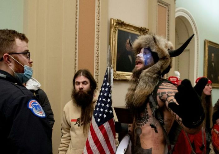
On a personal note, in my humble opinion, the fallouts from the recent storming of the Capitol prove that the claims about polarization were exaggerated. Even Mitch McConnell and Lindsay Graham, both senior Republican senators, said enough is enough and acknowledged defeat in the 2020 elections and so tried to put a stop to the bickering about the election results. Also, around this time, the Congress united to override the former president Trump's veto about the defense bill.
So, even if there was polarization, or a polarization trend, it was reversible, certainly when the delegates were faced with a real threat literally knocking on their door. The claims of partisanship seem to stem from looking at the politics at surface-level meaning the bi-partied system. It seems very natural and intuitive to think that the homophilic nature of political communities should be based on common party's membership. But parties are just one label you can tag a node with. It doesn't necessarily paint the whole picture. Communities in networks can crystallize on the base of other issues. As we know from empirical research, communities in networks often congregate on the base of geographical proximity. And when you think about it, political views are often the result of geography or vice versa. We'll tend to physically congregate with people who share are views, or the other way around: we'll tend to see the issues the same way because we share the same physical space. So, I guess it was a good idea to congregate people by electing them from all corners of society and sticking them together in the same building. This is how homophilia by geographical proximity is created.
The civil war is a classic example for this kind of mixed polarization. The ideological polarization stemmed not only from party affiliation but probably more so from geographical proximity.

This view of geography as an important factor in polarization, maybe even more important than party affiliation, is reinforced when looking at the greatest cross-party cooperators in the senate. As we've seen in one of the papers, the greatest cooperators in the Senate are Democratic senators from the south and Republicans from the north. We need to remember that political frameworks are not eternal, especially in the ideological sense, in contrast to geography that is much more stable.
Before we continue, a word about network analysis methodology:
We've gone through many papers here that used data filters on networks, and I think they've missed out on somethings because of it.
My take is that Networks don’t care for data filtering. "Trust the Power Law"', I say, to naturally filter out the long tail of the useless data. The Power Law will spring to our attention what's important either through the centrality measures or via community detection or best of all – through both.
When we filter the data ourselves, we bring forward our own biases, and isn't our data biased enough?
I hope we brought to the table some healthy skepticism about partisanship. Think about it: Is the US really more divided now than it was in the Civil War (where 620K died) or during the big demonstrations in the 1960s? Then why all the talk about polarization? Can we blame it on social networks? So, I'll take on myself to be the devil's advocate for a moment, because I see there are many charlatans out there, equipped with a headset and a low budget PowerPoint presentation, scaring the hell out of seniors citizens from the dangers of social media and Big Data.
And I'll start with a famous example that is attributed in pop culture to social media and that is The Arab Spring revolutions of 2011 and the many demonstrations and protests that spread throughout the world that year. With all due respect to Facebook, we call these events "the Arab spring" because of the 1848 "spring of nations" which was the most widespread revolutionary wave in European history. In the original version, to the best of my knowledge, they haven’t used Facebook or Twitter. Obviously, the turn of events wasn’t dependent on social media. It was something deeper that spread through the world, synchronizing the giant human networks. Note to self: The subject of synchronization in networks is a fascinating subject, and I should do an episode about it. I guess it wasn't social media that provoked the masses, cause we see provocations on social media all the time and most of them don’t amount to anything. I can also guess that there wasn’t much coordination on social media between the protests of the Arab spring and Occupy Wall street, although they took place at the same time, both challenging the powers that be. Maybe it has less to do with social networks and more with human character?
Just as a computer doesn’t make a person smarter but more efficient, so social networks haven't changed human character (at least for now) but just increased our ability to organize faster.
So let's focus on human angle: A study by Facebook and Lada Adamic, which examined the polarization among 10 million users, found that the choice of users to stay in their "comfort zone" or echo chambers is primarily human-driven, more than that of the newsfeed algorithm itself.
They found that the greatest influencers on the users, are the users surrounding them.
If you feel somewhat uneased by Facebook's self-study, we can check out a more qualitative study on the subject made by Shapiro (no relation) which is titled "Is the Internet Causing Political Polarization?"
This paper, from 2017, found that, in fact, it's the older population (75yo and up) that have tested positive to polarization. And ironically, it's the same group that is the least exposed to the Internet. For more answers, we'll need to turn to another network. Maybe the most fascinating network there is: The neural network in our brain. Note to self: The subject of the brain is a fascinating subject, and I should do an episode about it. In the meantime, you can tune to the great Ginger Campbell's Brain Science podcast which talks, among other things, about the plasticity feature of our brain or its ability to rewire and develop. Ironically, it is precisely this flexibility that makes us inflexible to other opinions: Once the brain detects what it believes to be "a successful pattern" it rewards itself by strengthening the connections or networks that detected it, thus, in a loop process, we become more rigid and tend more toward polarization.
I believe it's time to close the circle here with a unifying message brought to you by Adamic's paper about polarization on Facebook. This study found that about 20% of the users' friends have opposing political views. 20% of all social ties may not sound much but based on empirical knowledge of how communities engage with each other in networks, it sounds not only normal, bet even better than one could expect. And since the study was done on Facebook, which is probably the social networks that represents the widest range of human life, this result is probably close to home. Many of the studies about polarization were based on Twitter data. But Twitter represents only up to 280 characters of what we have to say, and so narrows our field of interest, making it more biased towards partisanship and a lower percentage of cross-factions discourse. It's very natural that 80% of our discourse will be with our nearest and dearest. It doesn’t necessarily mean that we agree with everything they have to say. On the contrary. There's an Arabic proverb that goes: " القرايب عقارب " meaning literally "those who are close to each other act like scorpions", meaning, ironically, that most of our arguments are probably with those whose opinions are closer to our own. I hardly find myself arguing with ISIS supporters or enthusiastic Nazis although I differ from them greatly about how to handle global issues. Bill Maher, the famous comedian, also addressed this phenomena many times on his show, criticizing the Democrats for nitpicking amongst themselves instead of standing united against their opposers. This is a tendency that Israel's left wing can easily relate to. This all means that communities that are homophilic based on political affiliation, aren't different in their structure or ties from any other kind of community with other homophilic traits. Communities are about keeping close those with whom we share interest. By default, this means that all others are at a distance. It doesn’t necessarily mean we feel polarized. For example, we don’t feel polarization when confronted with people who like different TV shows. Of course, with the exception of "The Wire". People who say they cannot watch this series should be shunned from decent society as they probably are. The reason we use the term "polarization" in politics, in my opinion, stems from the technicalities of the election process: We have a finite number of parties to choose from and those parties operate in a zero-sum game, win or lose. We project this way of thinking on the whole political arena, emphasizing our differences and ignoring the ties that keep us together. But the same levels of the so-called "partisanship" can be found between any two connected communities in any network. Because of the bi-partied system, there will always be some polarization, but do we really want to live in a political network where there's only one community and not an ounce of polarization?
And now, for another optimistic view about unity or – "one conference to rule them all":
The biggest network science conference ever that will be held in 2021, is the first conference to combine the annual meeting of the International Network for Social Network Analysis (INSNA) and the Network Science Society (NetSci).

The main conference will run from July 5-10 and hopefully it will become a NETfrix special. Since the conference will be virtual, I had to forsake my plans on going Ryan Seacrest and interview the famous & glamourous network scientists on the red carpet. Oh, well.. So, sign up to the conference and tune in to NETfrix. Another update is about Compile Band!
They finally release their 1st album, ten days before Netflix's birthday (22/2/21)!
A teaser link that plays the overture of their new song in code is available here.
Did you enjoy, and want to share? Have you suffered and you do not want to suffer alone?
Tell your friends or rate us on apple podcasts, like our Facebook page, or follow us on Twitter.
If your'e from Israel, rate us on podcasts of Israel.
The music is courtesy of Compile band. check them out!
See you in the next episode of NETfrix (:


Comments